The Family Recipe is in Safe Hands
A brand infused with the heart and soul of Nonna’s cherished recipes.
BRAND IDENTITY & PRODUCT PACKAGING
The Challenge
The challenge in branding Angelina’s was to capture the warmth of Pasta Sundays at Grandma’s—nostalgic yet simple, balancing tradition with modernity and a hint of Nonna’s humor.
The Solution
Remembering the feeling of my family's Sunday dinners was an essential part of channeling that feeling into a brand. The family connection, the loud conversation, the food! Bringing it all together to share my family with yours.
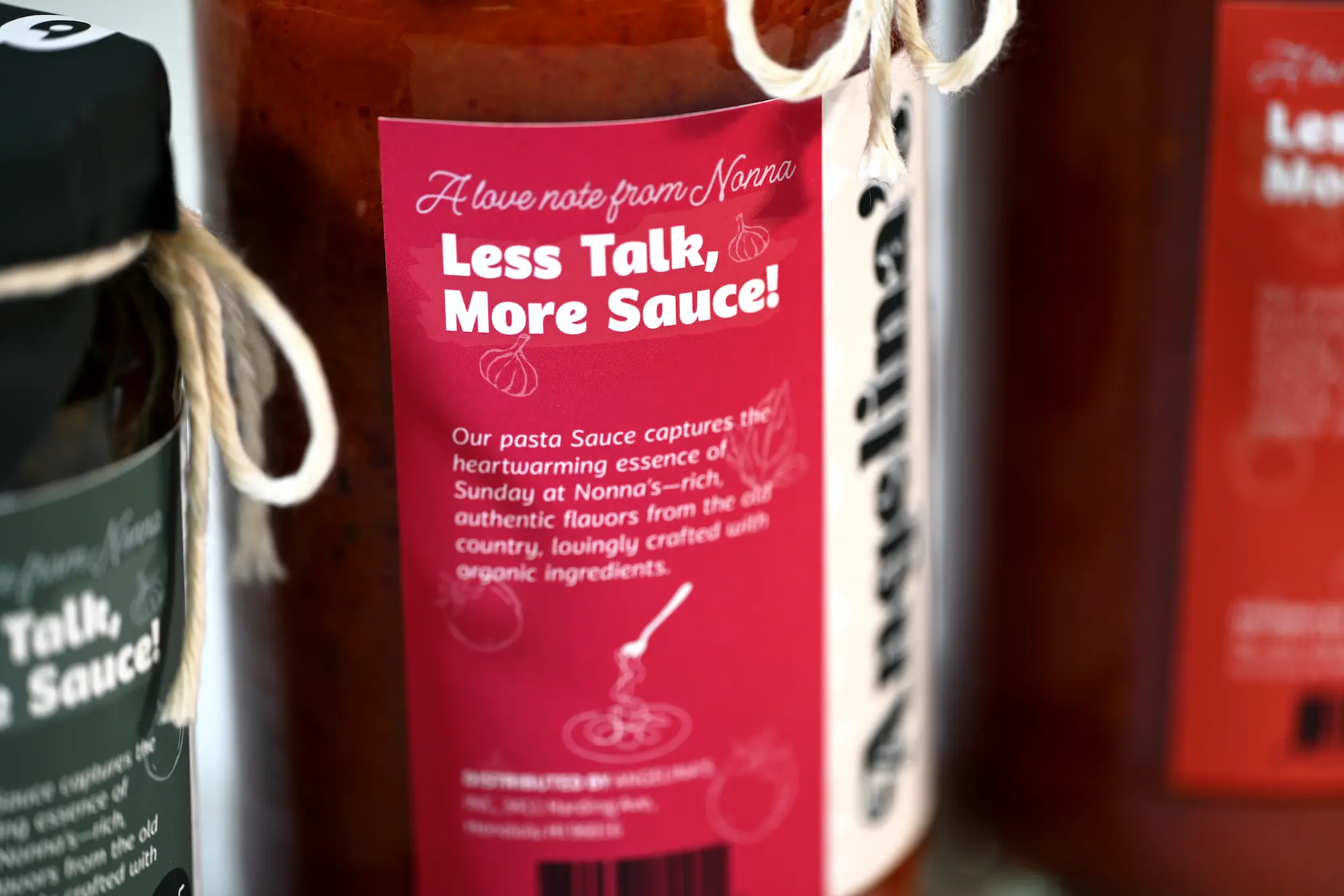
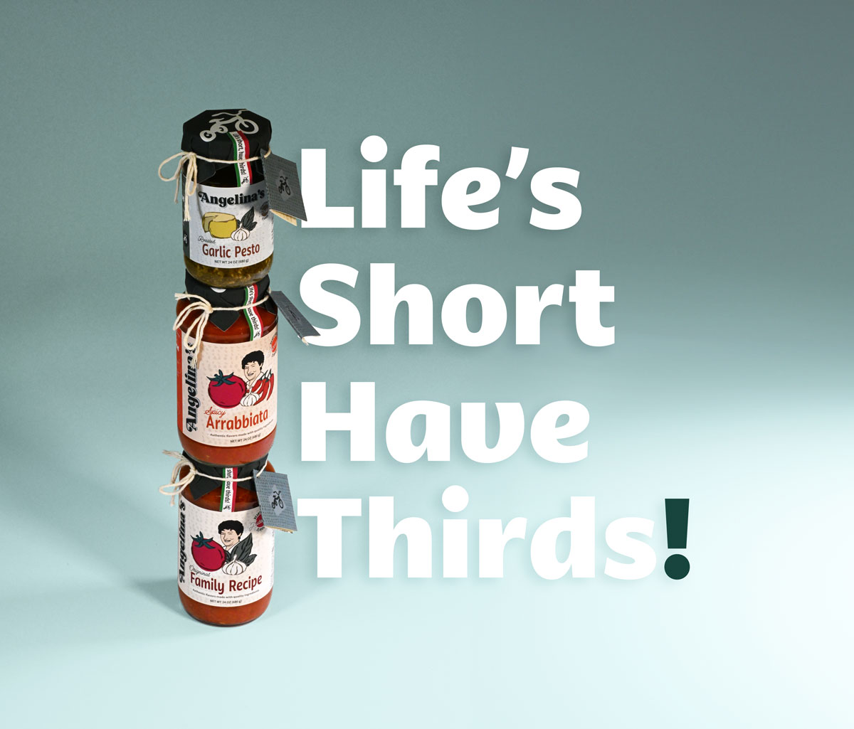
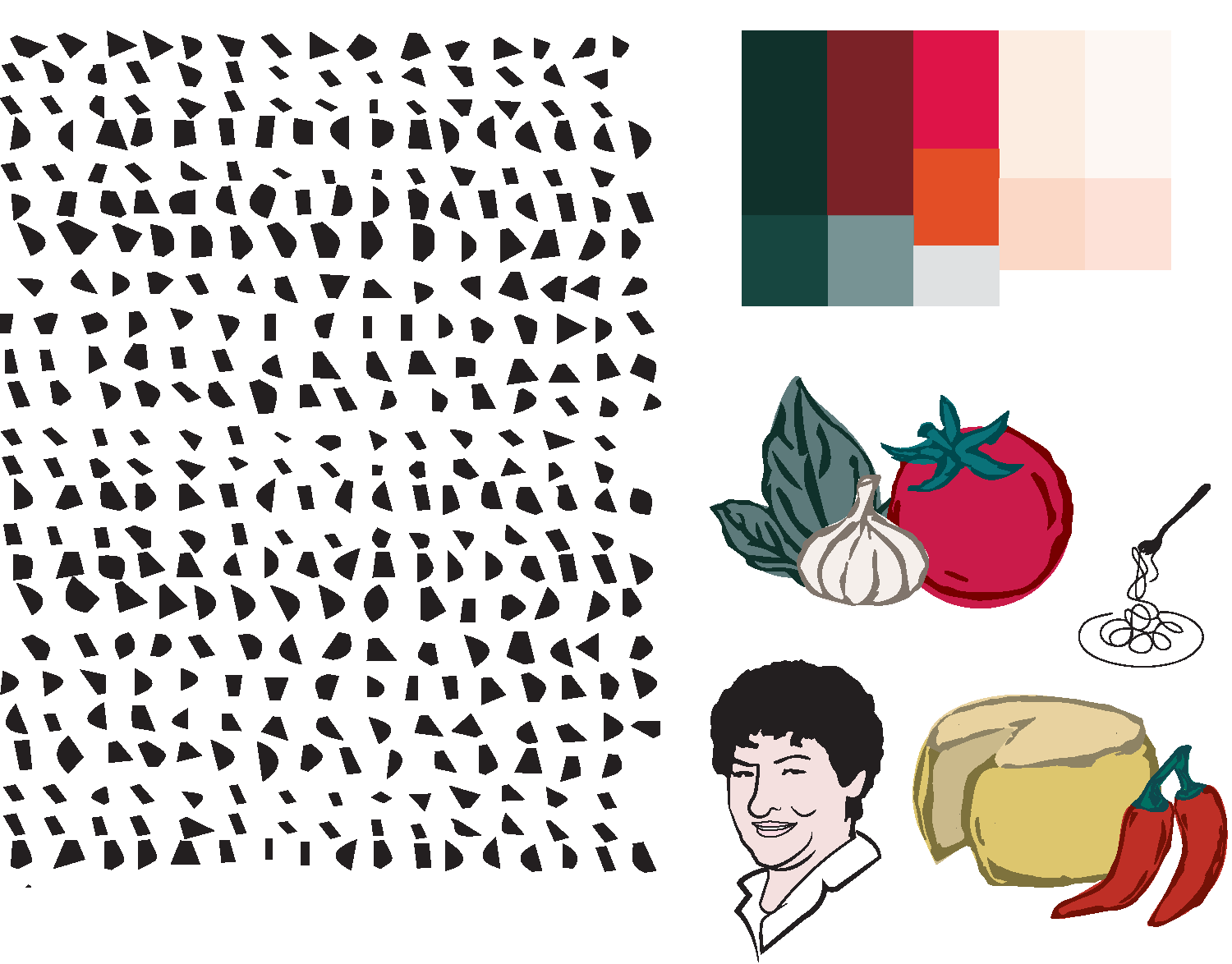
Meet Nonna Angelina—The Sauce Queen!
Although she is serious about the ingredients and quality of her cooking, life does not need to be as serious all the time. In fact, she thinks humor is an important ingredient we add to make the flavors just right! Like we always say about Nonna Angelina, “She damn well knows how to cook, but we would not trust her to drive.”
LOGO
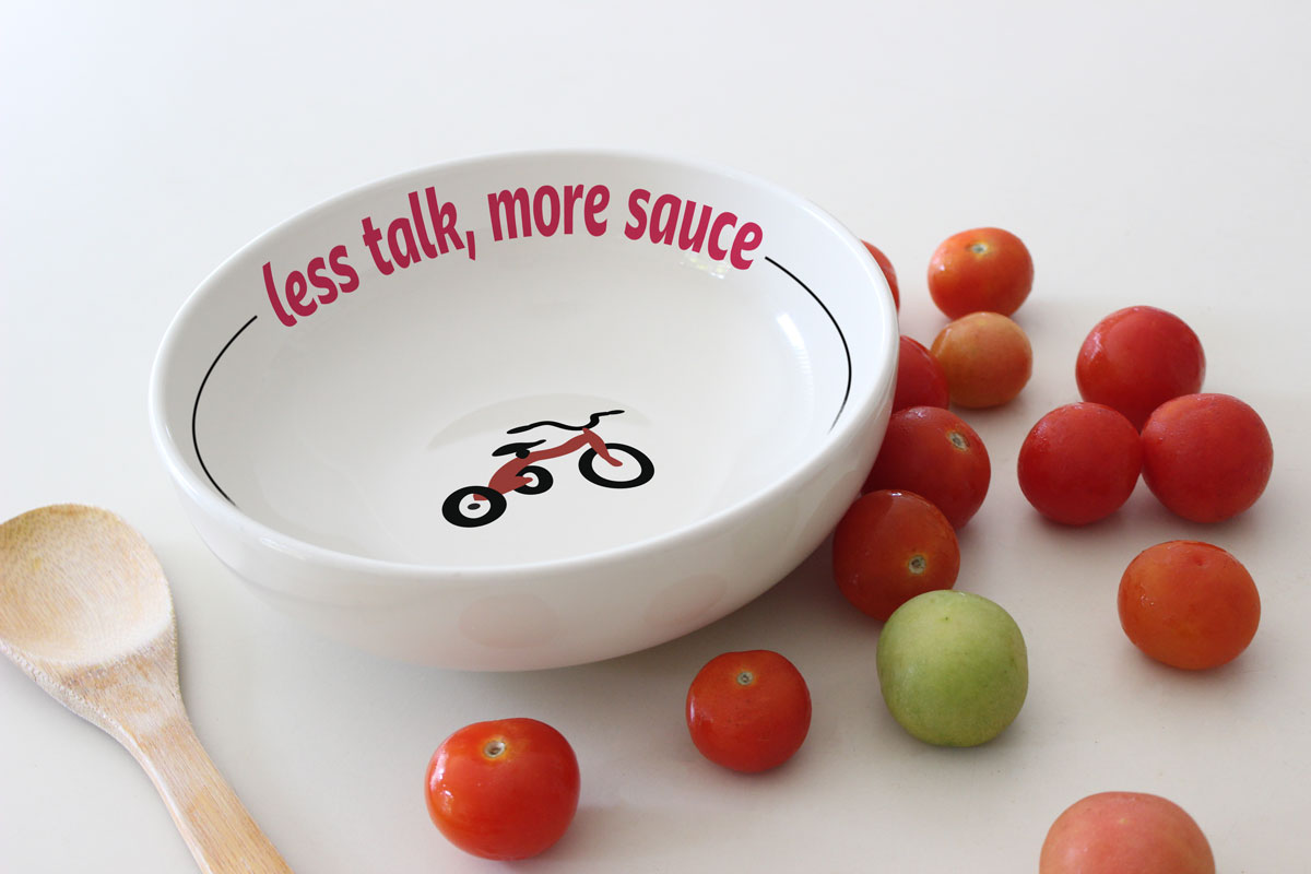
The Red Tricycle
The iconic red tricycle was introduced to evoke a sense of nostalgia and symbolize family, inspired by the one my grandma—and many others—kept for her grandchildren, connecting meals with moments of joy and togetherness.
COLOR & VISUAL ELEMENTS
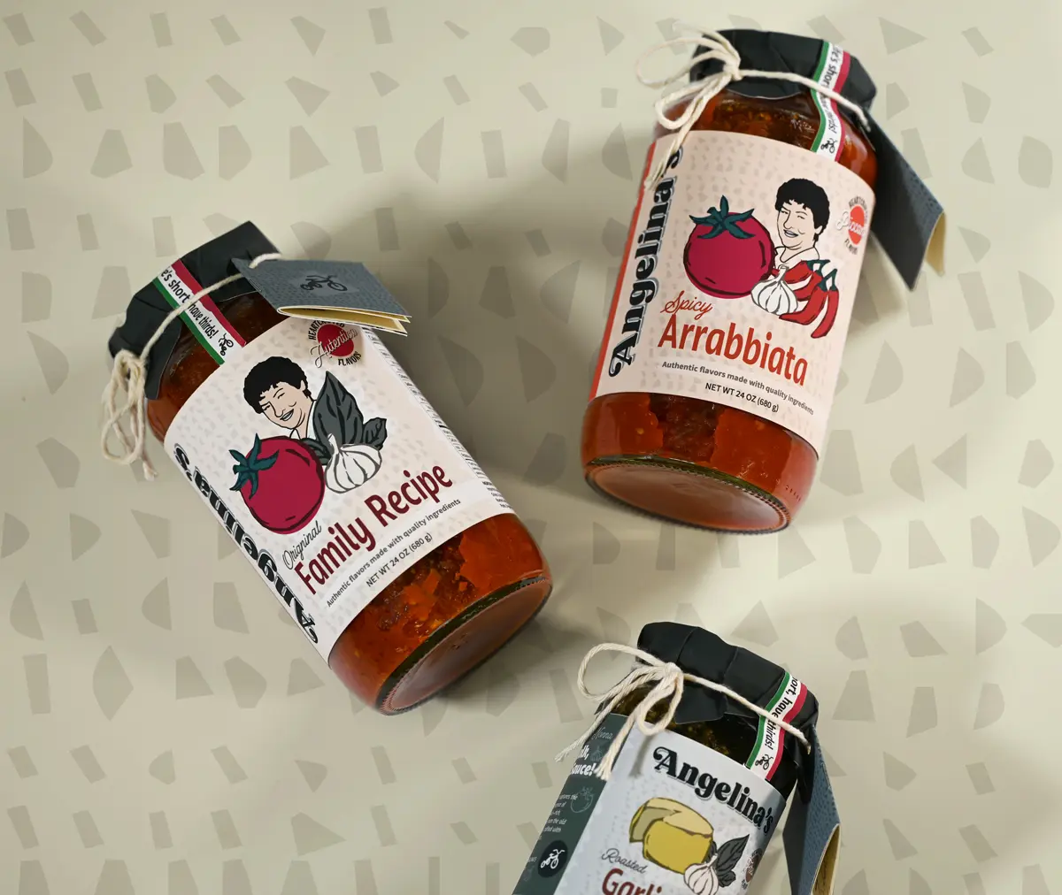
The Essence of Flavor
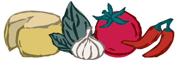
The brand comes to life with an appetizing color palette inspired by the product’s flavors, accompanied by the textured illustrations that reflect the tradition of handmade Italian recipes.
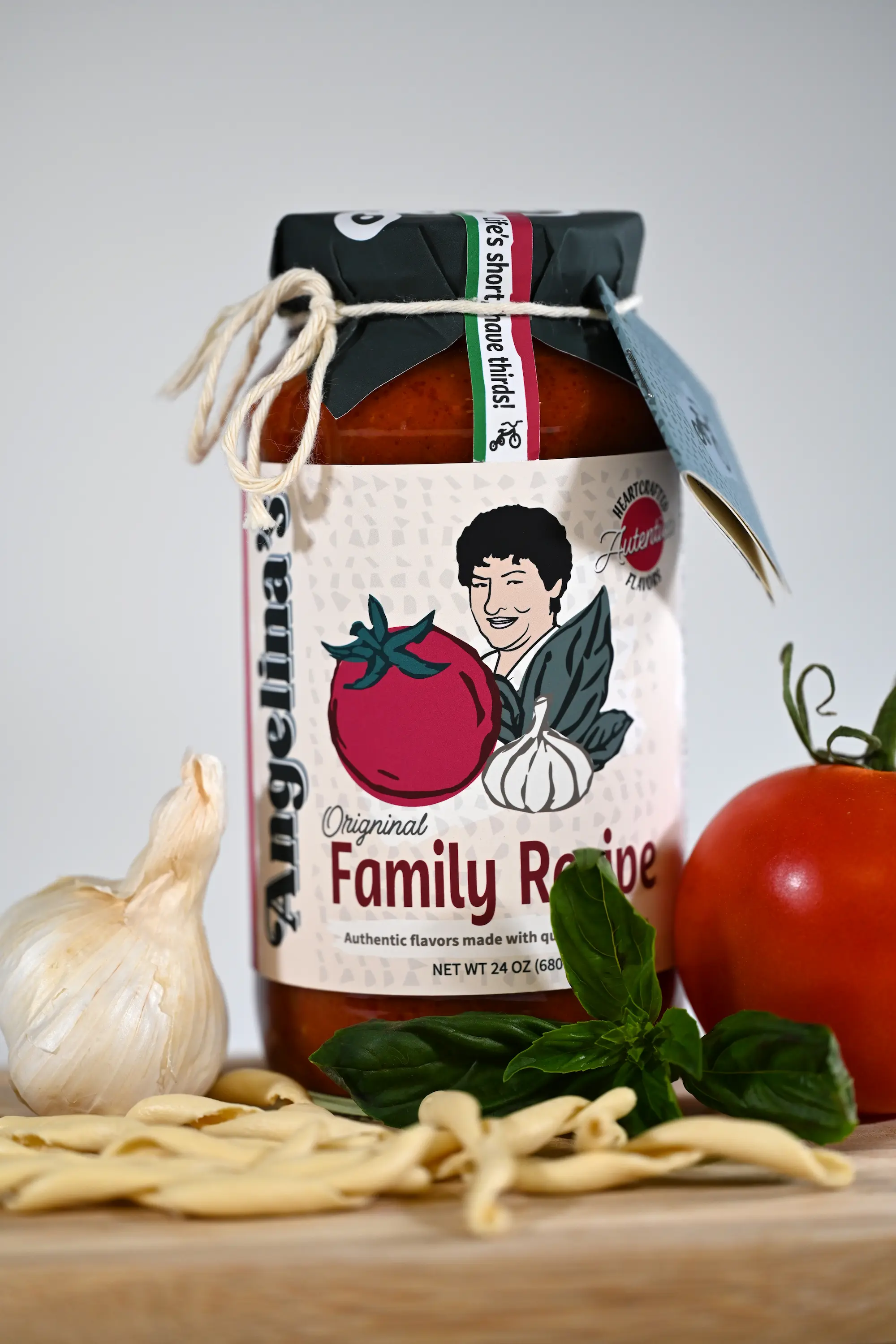
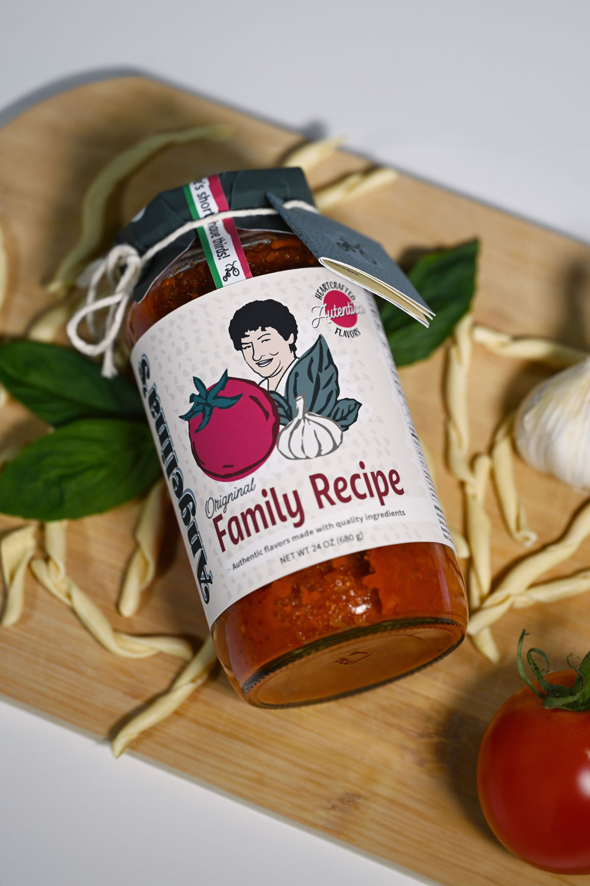
PRODUCT PHOTOGRAPHY
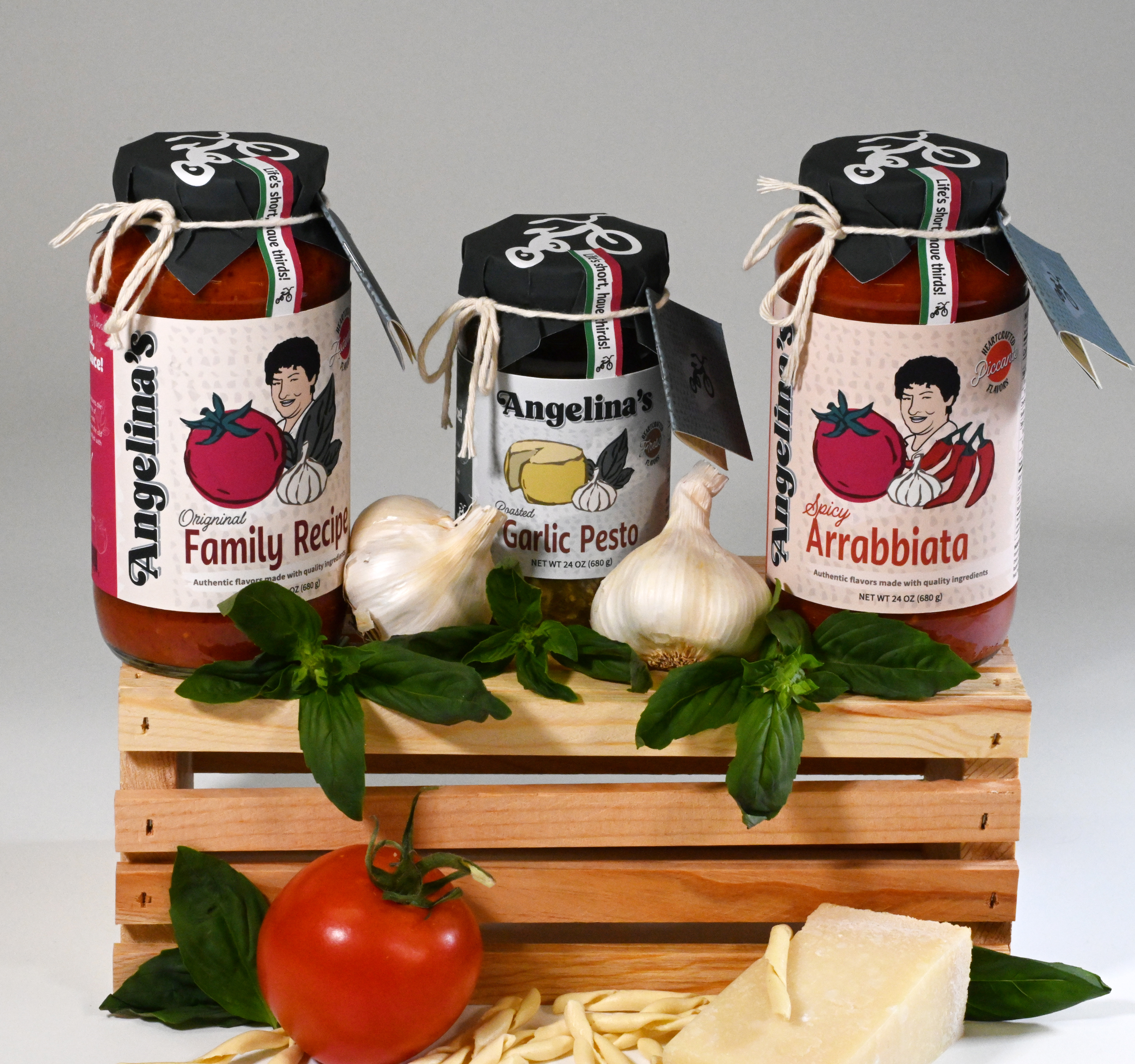
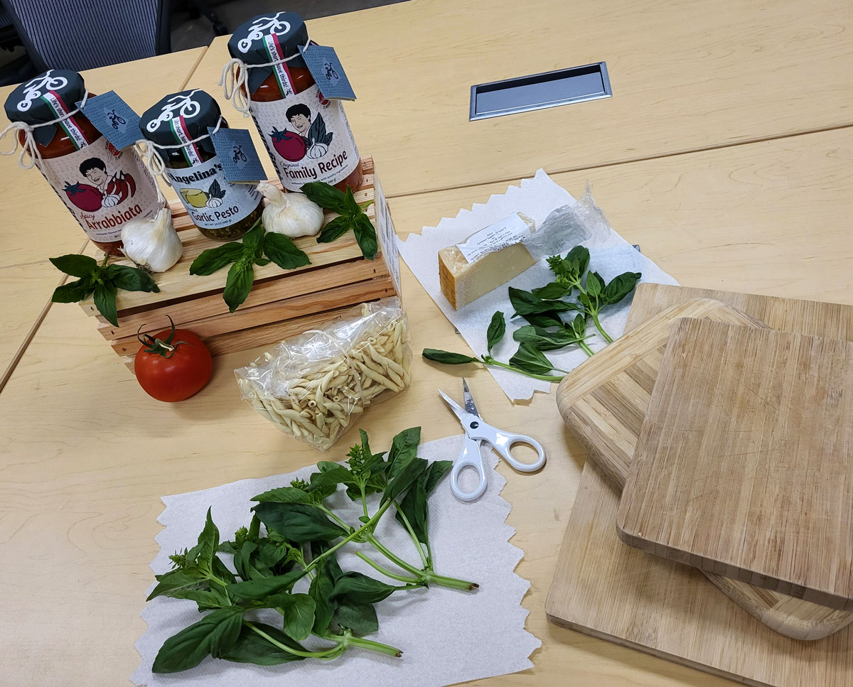
Capturing the Brand in the Studio
In the studio, I captured product shots that reflect the brand’s essence, highlighting fresh ingredients and using rustic boards for an artisanal, homemade feel.
Scroll down to see