Putting the Pieces Together
A brand that reminds us that just as every puzzle piece counts, so does every effort towards a better world.
BRAND IDENTITY & PRODUCT PACKAGING
The Challenge
To develop a brand identity for a puzzle company that balances creativity and playfulness with a mission to advocate for social and environmental causes, empowering consumers to make a difference.
The Solution
The Missing Peace’s identity uses a welcoming color palette, playful patterns, and creative illustrations to foster inclusivity. Bold typography paired with an eloquent message creates a harmonious blend of fun and awareness.

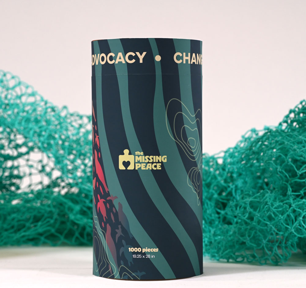
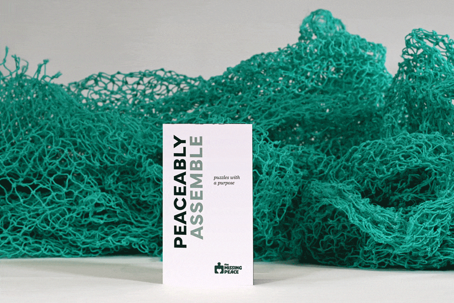
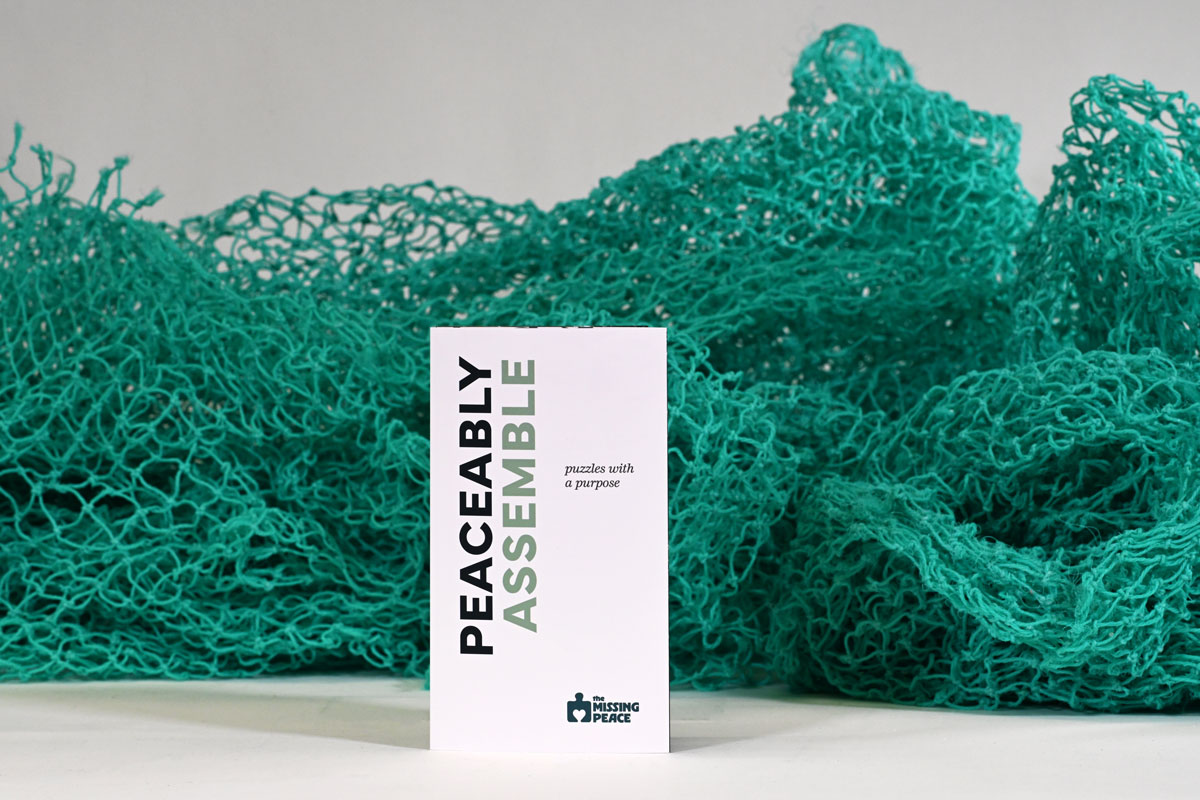
Peaceably Assemble!
The Missing Peace isn’t just about puzzles—their mission is to create a harmonious connection between personal well-being and positive change, helping you unwind while supporting causes that matter.
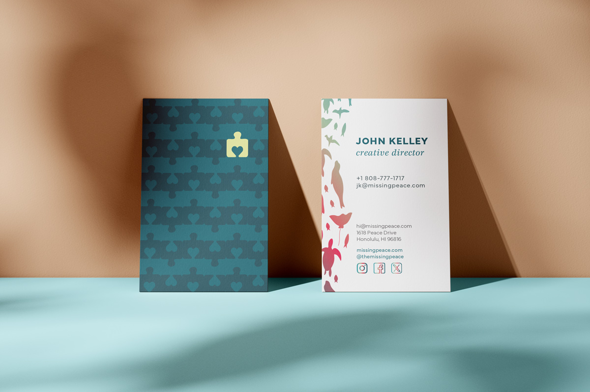
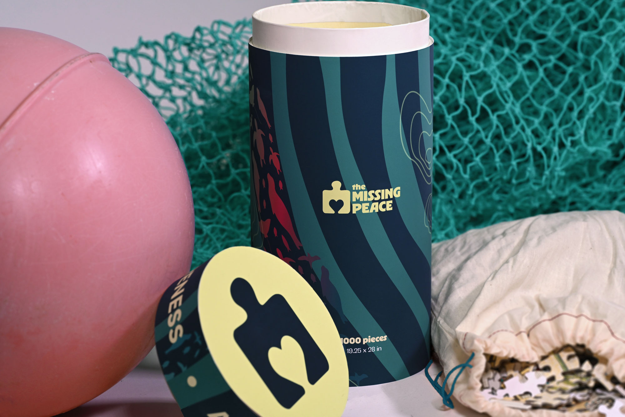
LOGO
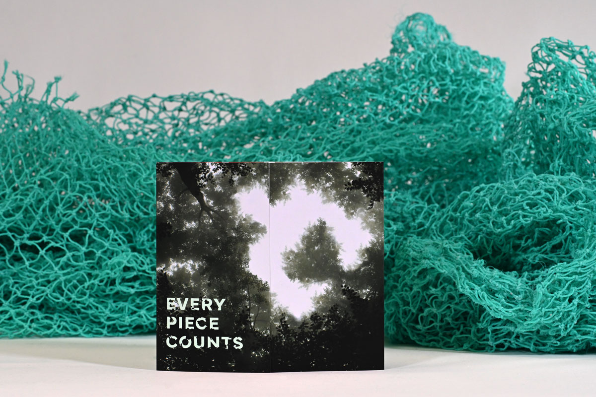
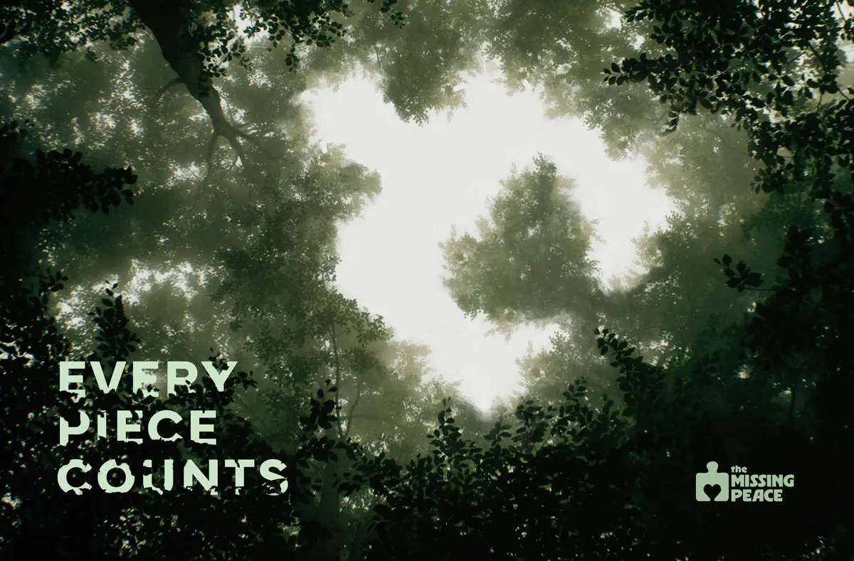
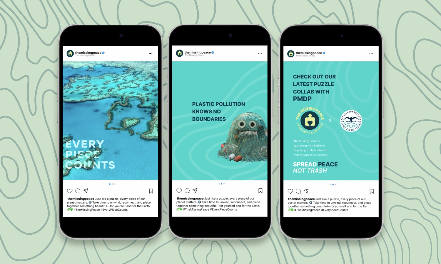
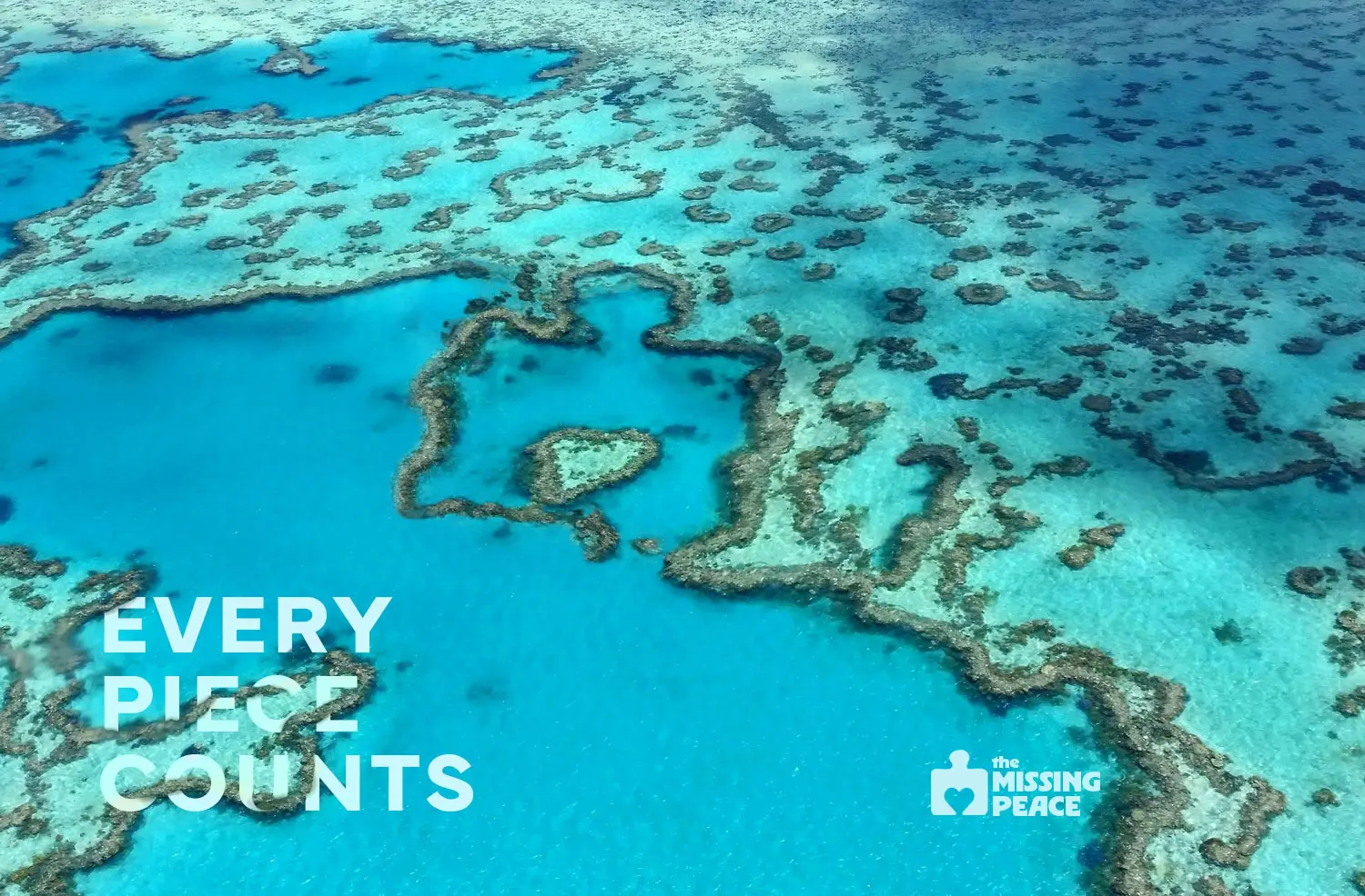
Every Piece Counts
The logo features a playful puzzle piece, symbolizing our connectedness to each other and the planet. The heart cutout serves as a reminder that compassion binds us together and is essential to building a better world.
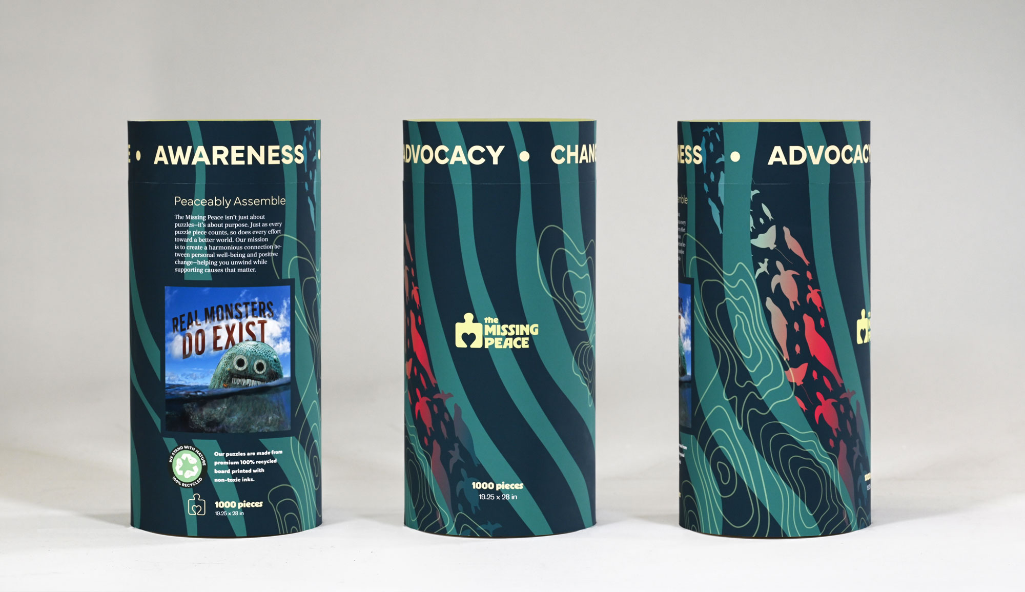
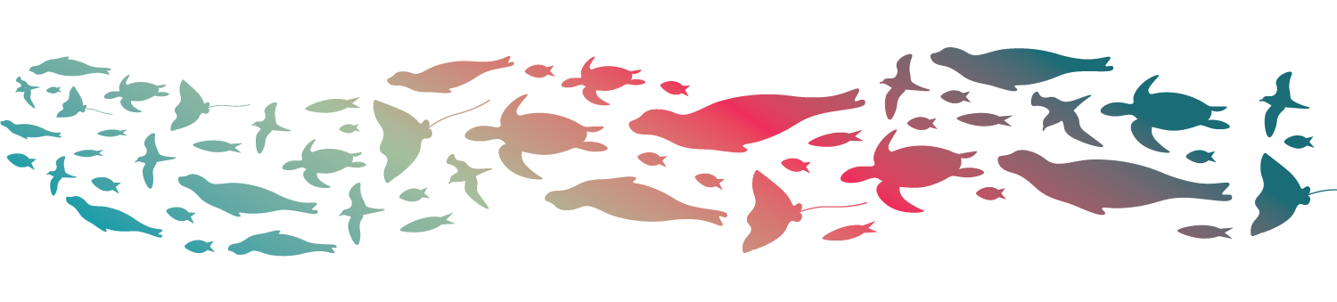
COLOR & VISUAL ELEMENTS
Colors of Compassion
The Missing Peace partners with a range of causes, each contributing something meaningful to the world. The versatile color palette allows the brand to adapt while staying true to our identity.

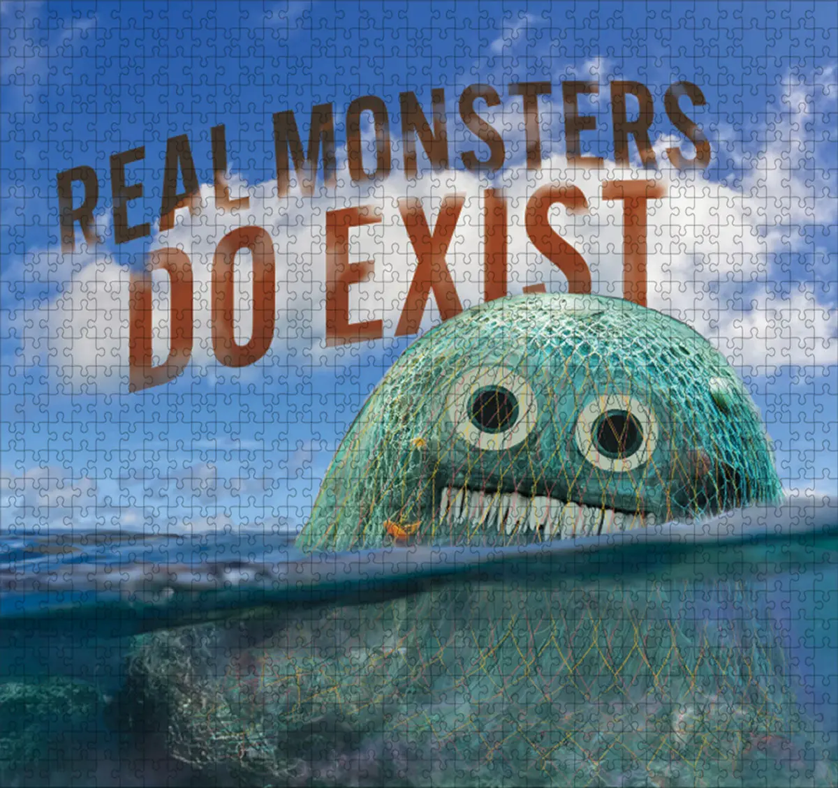
UTILIZING AI
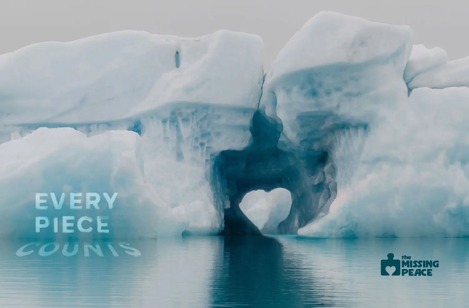
Making a Net Monster
I began by using AI to generate a base image of my Net Monster, then customized it in Photoshop by layering in original elements like trash and a customized netting to create a unique design.
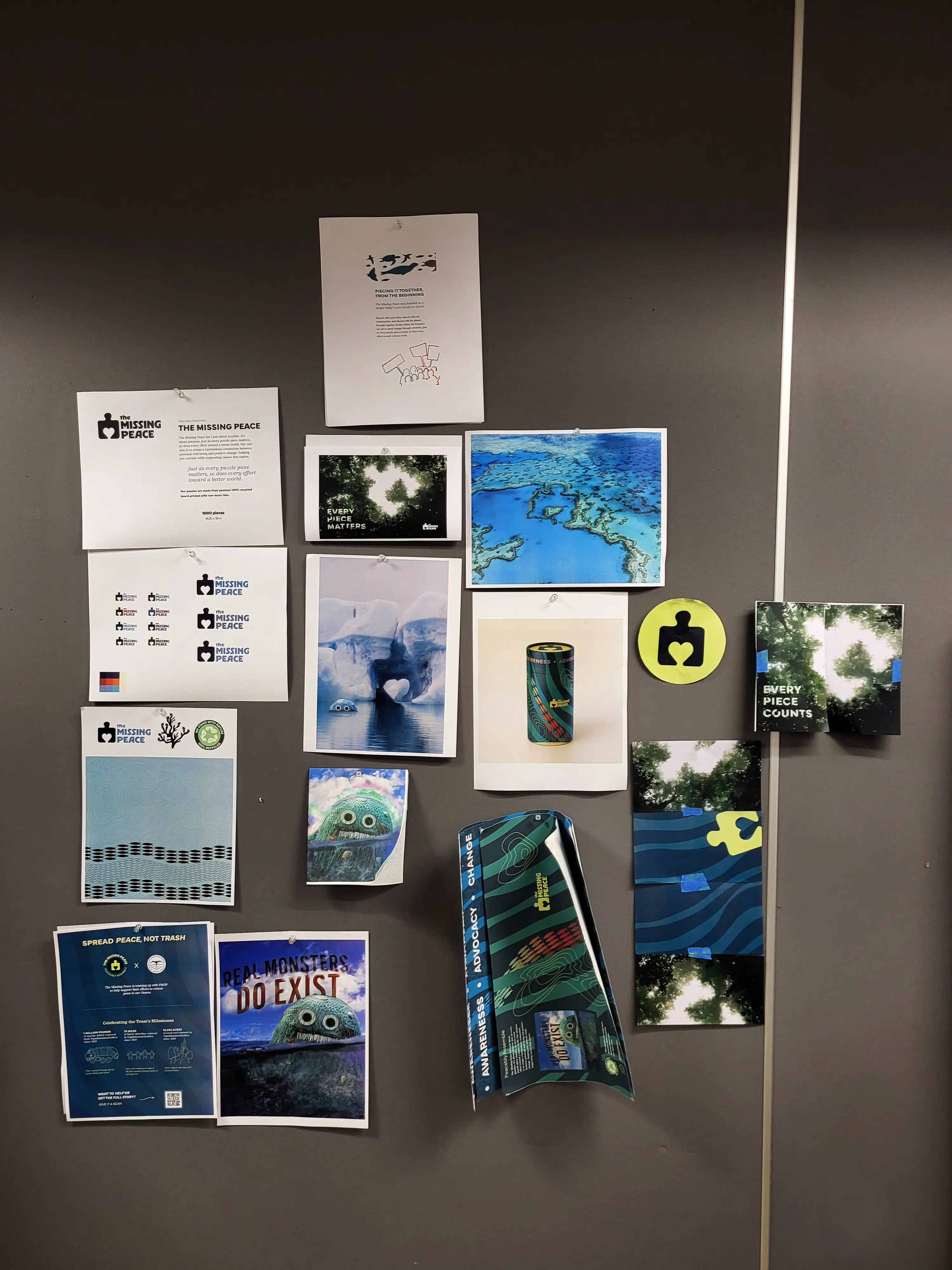
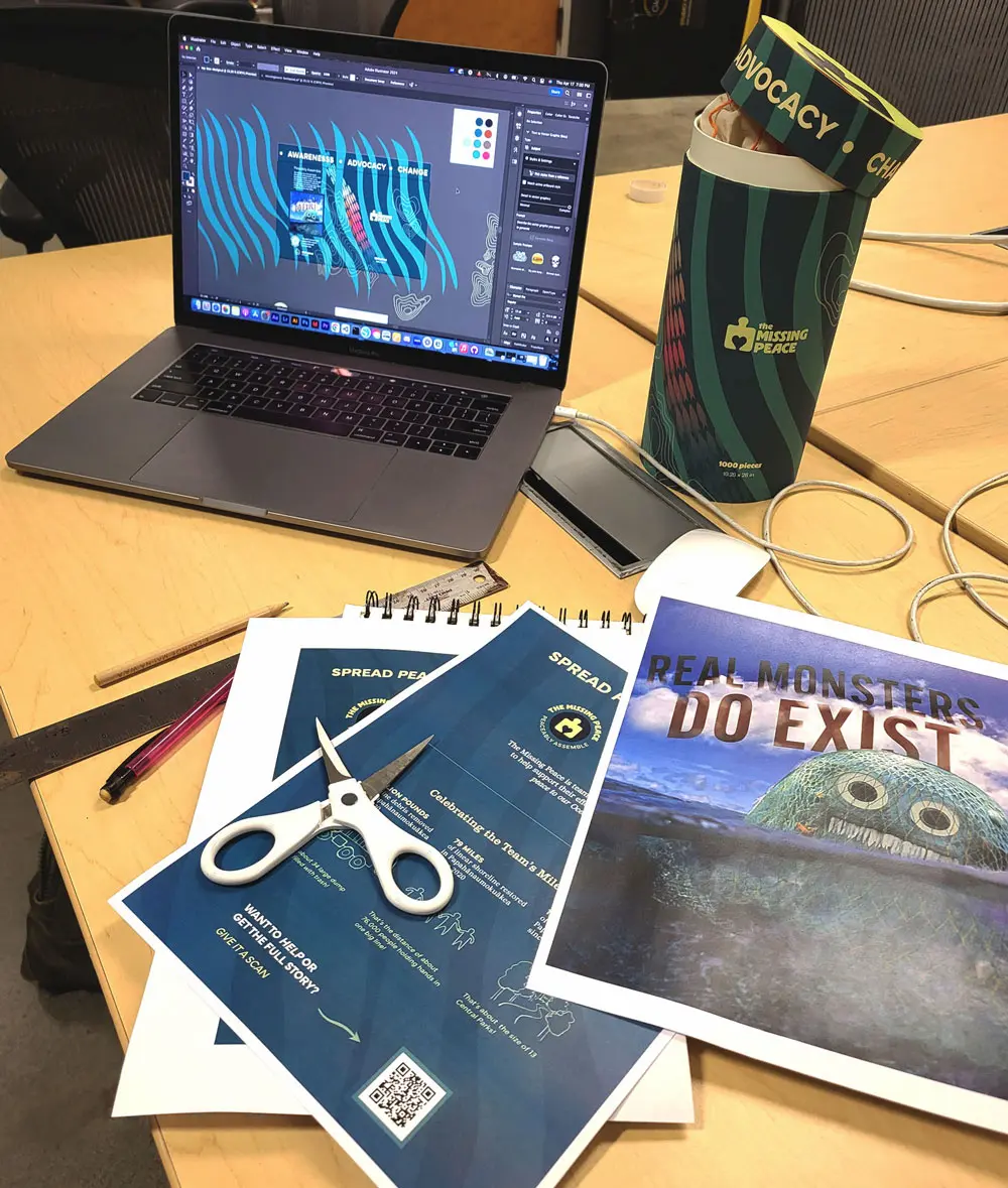
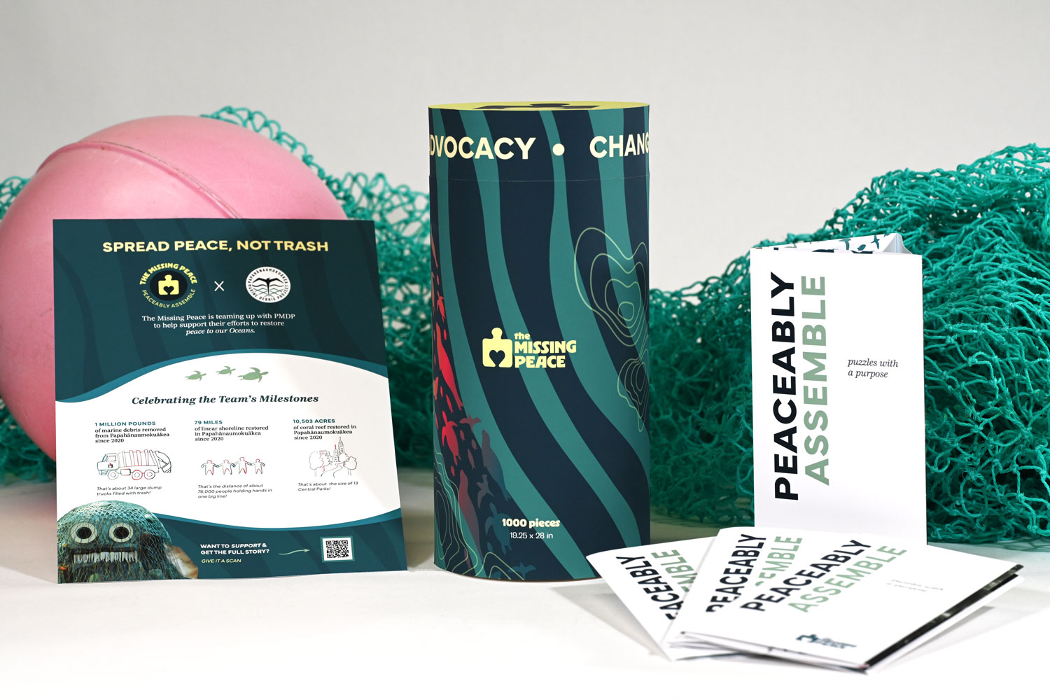
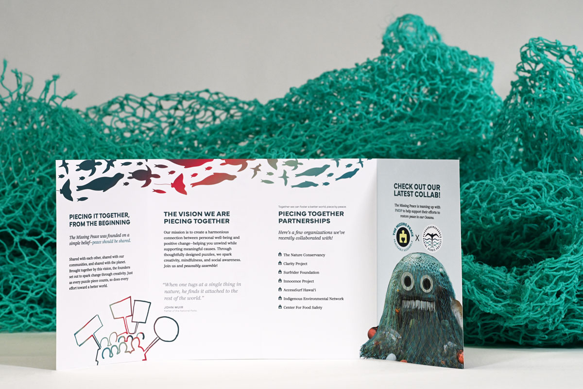
PRODUCT PHOTOGRAPHY
Capturing the Brand in the Studio
In the studio, I captured product shots that highlight the brand’s environmental mission—using ocean plastic to frame packaging and visuals, reinforcing its message of advocacy and impact.
Scroll down to see